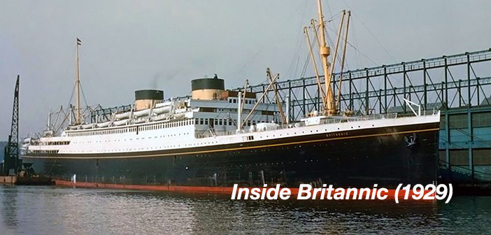
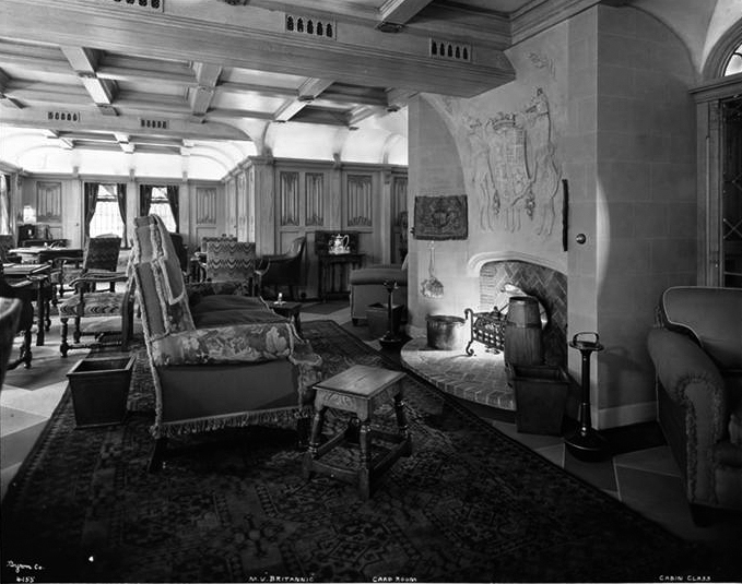
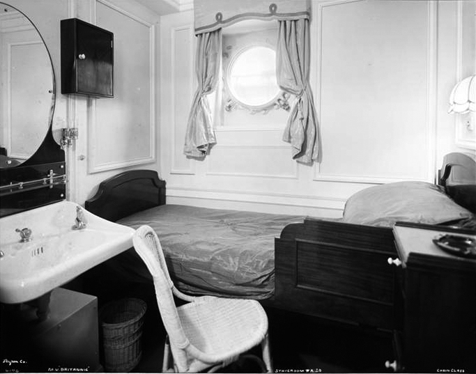
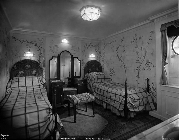
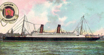
From the outside, Britannic (1929) appeared fierce and modern. On the inside, however, the new White Star Line vessel looked like she was designed by someone’s great grandmother. (A great grandmother with appalling taste.)
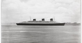
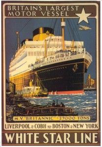 Arriving at the dawn of a new generation of sleek, Art Deco-inspired liners, like Bremen and Normandie, Britannic’s interior was firmly rooted in the past. If Britannic had been launched in 1910 or perhaps even 1920, her stodgy styling would not have seemed so anachronistic. But for a liner designed during the Roaring Twenties—the Jazz Age—Britannic was a stylistic dud.
A quick look around Britannic shows that by the late 1920s, White Star was running on fumes, cutting corners on design and firmly mired in a past era when the company was still a transatlantic giant.
Take quick a look inside Britannic on the following pages to see why it was that Cunard Line absorbed White Star and not the other way around.
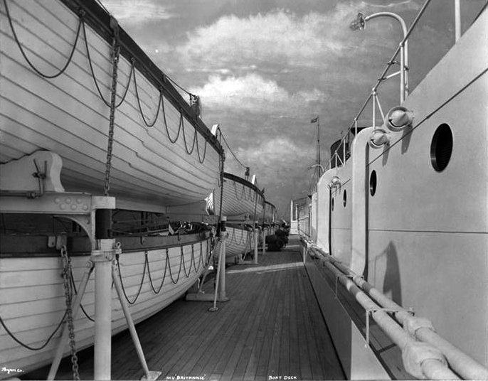
Try to enjoy the sea view on Britannic’s crowded Boat Deck. Did they hold muster drills here? There doesn’t seem to be much room.
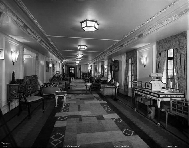
Cabin-Class, Long Gallery. Does that geometric carpet really match the rest of the room’s chintzy decor? With apologies to The Big Lebowski, it doesn’t exactly tie the room together.
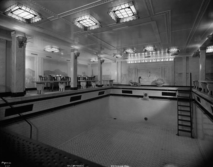
Cabin- and Tourist-Third Class, Swimming Pool and Refreshment Tables. Arguably, the most attractive location on Britannic. (Did that duck float?)
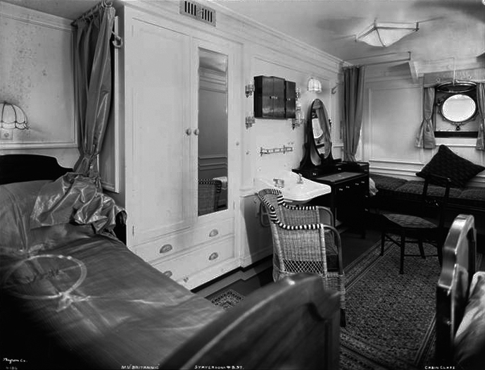
Cabin-Class, Bed and Sofa Stateroom # B.37. Today, this would be called “shabby chic.” In 1929, it just looked shabby. (An indoor wicker chair?) Other than the porthole, we’re looking at a room in a convalescent hospital.
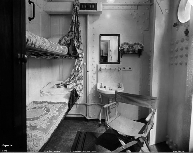
Third Class, Two Berth Stateroom #26 Section D. You could put this cabin on a modern cruise ship and call it the “Steam Punk Suite.”

Please help keep Ocean Liners Magazine afloat. Any amount will be greatly appreciated.
—Regards, John Edwards, Editor/Publisher.

